PORTFOLIO
by keely jonathan
MAJOR PROJECT
Welcome to my major project. For this project, I chose to revisit and redesign two packaging projects from early in my design journey, along with a rebrand of the Gold Coast. My goal was to refine and elevate these works to reflect my current design abilities and creative direction. Through this process, I focused on improving consistency, layout, and overall presentation to bring each project up to an industry ready standard that aligns with my personal brand and design style.
BOTANICAL
REDESIGN
Botanical was a project I originally completed during my time at TAFE. I chose to revisit and update it to create a more modern and refined look. I introduced sleek, contemporary illustrations and refreshed the colour palette to clearly distinguish the two products, using green and yellow tones for the day cream and blue and purple for the night cream. These updates not only improved the visual appeal but also enhanced the overall branding, helping each product feel distinct while still cohesive as part of the same range. The redesign reflects my growth in packaging design and my ability to create polished, professional designs.
“The redesign shows a clear step up in professionalism, the colour palettes are very considered and clearly distinguish the two products while keeping them cohesive as part of one brand.” Stephen Jonathan, Graphic Designer
The design looks so much more modern compared to the original version. I love the contrast between the deep blue and soft purples for the night cream, it feels calming and luxurious.” Peer Review

BEFORE


I conducted user testing with both my classmates and people who are not designers on the redesigned packaging and received positive feedback overall. Participants noted that the updated designs looked much more modern and professional compared to the original versions. They particularly liked the strong contrast between the two packages, saying it clearly differentiated the day and night products while still keeping them visually cohesive as part of the same brand. Many also commented that the refined illustrations and colour choices made the packaging feel more high-end and suited to a contemporary skincare range.
My mentor Stephen Jonathan a designer who has 30 years experience in freelance and in studio design, also mentioned that the redesign was a clear step up in professionalism, highlighting how the refined colour palettes effectively differentiate the two products while maintaining a cohesive brand identity. He noted that the updated design feels more balanced and visually polished, showing strong attention to detail and a clear understanding of brand consistency. Overall, he felt the redesign reflected my growth as a designer and my ability to create packaging that feels both modern and commercially ready.
MENTOR HELP
DRAFT VERSIONS WITH MENTOR HELP


-
My mentor suggested updating the colour palette to create a more modern and sophisticated look.
-
He also recommended refining the illustrations to better suit the overall aesthetic of the brand.
-
In response, I completely redesigned the illustrations, creating cleaner and more contemporary linework.
-
The updated visuals helped make the packaging feel more cohesive, balanced, and professional.
-
These changes also strengthened the overall brand identity and clearly differentiated the two products while keeping them connected as part of the same range.
EDEN COSMETICS
REDESIGN
Early in the trimester I revisited one of my earlier packaging projects, Eden Cosmetics, to update and refine the overall design. I focused on correcting the stretched packaging die lines and enhancing the illustrations to achieve a more polished and cohesive look. This project reminded me of how much I enjoy packaging design and how it allows me to combine illustration and branding in a meaningful way. With my mentors guidance, I was able to refine the design further, creating cleaner illustrations and a more professional, industry ready outcome.

You’ve really elevated this design. The illustrations now look elegant and contemporary, and the new layout feels aligned with a high-end skincare brand.” Mentor Stephen Jonathan
“This redesign feels polished and cohesive — the softer shapes and improved illustrations make the packaging look high-end and well-resolved.” User Testing

BEFORE


MENTOR HELP
-
My mentor suggested softening the overall design to make it feel less harsh and more balanced.
-
He recommended adjusting the rectangular backgrounds behind the illustrations to appear softer and more cohesive.
-
He advised fixing the stretched packaging to improve proportion and presentation.
-
He encouraged me to update and refine the illustrations to create a more polished and professional look.
-
Overall, his feedback focused on improving consistency, refinement, and visual harmony across the packaging range.
GOLD COAST LOGO AND POSTCARD REBRAND
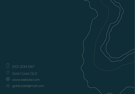
For my other redesign, I revisited a logo and business card project I had originally created during my time at TAFE. I chose to update the colour palette to shades of blue and turquoise, reflecting the vibrant tones of the Gold Coast’s beaches and coastal lifestyle. To enhance this concept, I incorporated fine wave like line illustrations on the business card, adding a subtle visual texture that ties into the seaside theme. These updates helped create a cleaner, more modern identity that captures the relaxed yet professional essence of the Gold Coast brand.
The updated colour palette feels much more modern and suits the Gold Coasts natural beach environment. The blues and turquoise tones capture the coastal vibe beautifully.” User Testing
“The design feels more sophisticated and less dated than before. The colours and illustrations work really well together.” User Testing

BEFORE

MENTOR HELP
-
My mentor suggested updating the colour palette to more modern tones that better represent the Gold Coast’s beaches and coastal environment
-
He recommended replacing the bright turquoise and gold with softer blues and turquoise shades for a more contemporary look
-
My mentor suggested using consistent spacing and alignment across the logo and business card to give it a more polished, professional finish